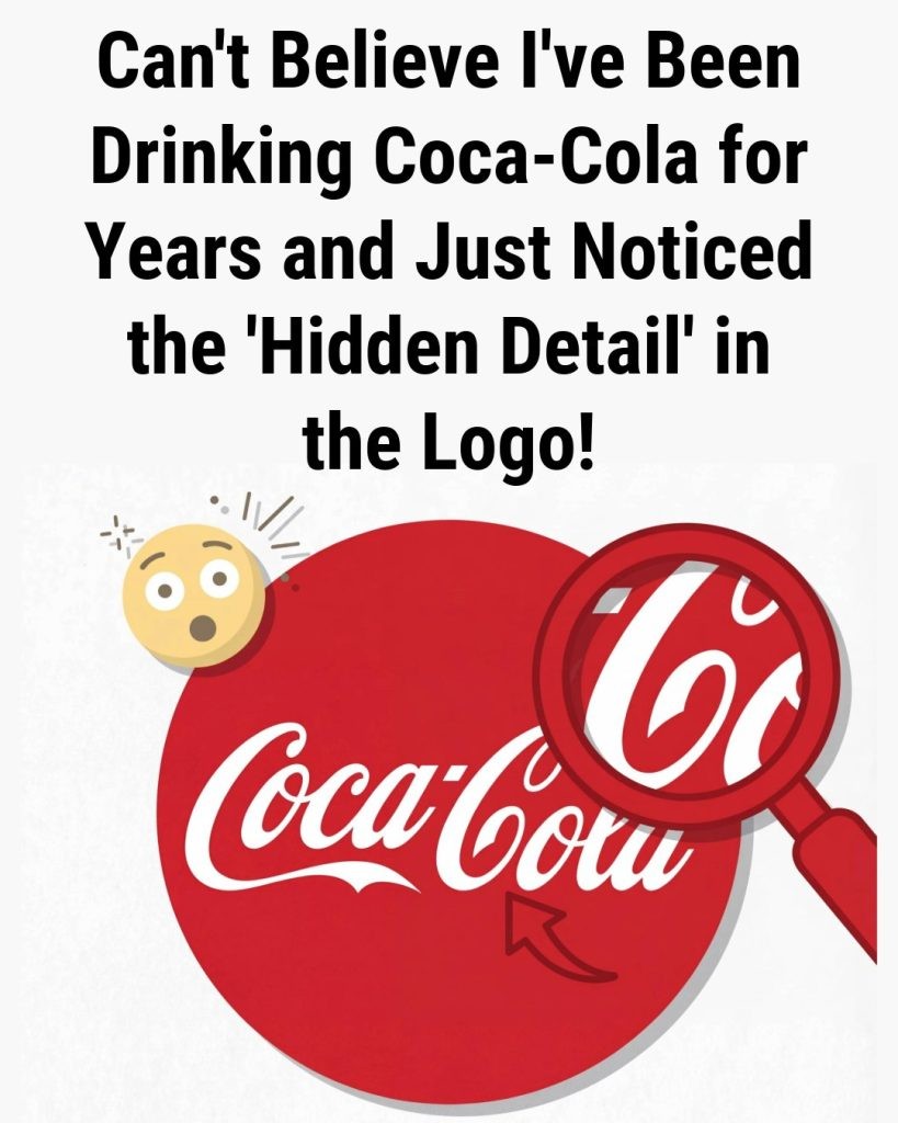
Is There a Hidden Smile in the Coca-Cola Logo?
The Coca-Cola logo is one of the most recognizable brand marks in the world. Its flowing white script against a red background has appeared on bottles, signs, advertisements, clothing, and holiday campaigns for generations. Yet many people notice something else when they look closely: what seems to be a small smile within the sweeping curves of the word “Coca-Cola,” especially around the second “C” in “Cola.”
The observation is easy to understand. The script’s rounded forms and curved strokes can appear expressive, almost as though the logo has a friendly facial gesture embedded in it. Once viewers see that possible smile, they may find it difficult to look at the design in quite the same way again.
But is the smile a deliberate hidden message from Coca-Cola’s designers, or is it an example of how people naturally interpret familiar visual shapes? Available historical information points to the latter. The Coca-Cola wordmark was created in the late nineteenth century using a popular handwriting style, and there is no reliable evidence that its original creator intended to include a smile, face, or secret emotional symbol.
The Origins of the Coca-Cola Script Logo
Coca-Cola was introduced in 1886 in Atlanta, Georgia, by pharmacist Dr. John S. Pemberton. The name Coca-Cola and its distinctive early lettering are closely associated with Frank M. Robinson, Pemberton’s bookkeeper and business partner. Robinson is widely credited with suggesting the name and writing it in the cursive style that became the foundation of the brand’s enduring visual identity.
According to Coca-Cola’s corporate history, Robinson believed that the two capital “C” letters would look appealing in advertising. He wrote the name in Spencerian script, a formal penmanship style that was widely used in the United States during the nineteenth century. At the time, Spencerian writing was associated with business correspondence, professional documents, education, and elegant commercial signage.
The style is known for graceful loops, tapered strokes, connected lettering, and dramatic flourishes. These features were not unusual in the era in which the logo was created. Instead, they reflected a broader design culture that valued skilled handwriting and ornamental lettering before modern sans-serif corporate logos became common.
This historical background matters because it gives a straightforward explanation for the logo’s appearance. The curved forms were a feature of Spencerian penmanship, not necessarily a coded visual device. The shape that some viewers identify as a smile is most likely a byproduct of the lettering’s rhythm and decorative movement.
Is the Coca-Cola Logo Smile Intentional?
There is no established historical documentation showing that the Coca-Cola logo was designed to contain a hidden smile. Publicly available company histories and accounts of the mark’s creation focus on Frank M. Robinson’s use of Spencerian script and on the commercial appeal of the name itself. They do not describe an intention to hide a face, smile, or psychological symbol in the lettering.
Claims about hidden messages in famous logos often spread online because they are visually engaging and easy to share. A person may draw attention to a curve, rotate an image, or circle part of a letter to make a resemblance more noticeable. This does not necessarily mean the original designer created the feature deliberately. Visual resemblance and intentional symbolism are not the same thing.
It is also important to distinguish between later brand interpretation and original design intent. Modern audiences see the Coca-Cola logo after decades of advertising that has emphasized happiness, friendship, refreshment, celebration, and shared experiences. These associations may make a friendly curve seem more meaningful than it would in an unrelated typeface.
In other words, the perceived smile can be real as an individual viewing experience without being an officially planned part of the logo. People can genuinely see a warm expression in the script while historical evidence still supports a more practical explanation: the design follows the conventions of an elegant nineteenth-century writing style.
Why People See Faces and Smiles in Everyday Objects
The apparent smile in the Coca-Cola logo can be understood through a well-known aspect of human perception. People are highly sensitive to faces and facial expressions. The brain rapidly identifies face-like patterns because recognizing other people has long been important for communication and social interaction.
This tendency is often called pareidolia. Pareidolia is the perception of a meaningful image, sound, or pattern where no deliberate image or message exists. Common examples include seeing faces in clouds, electrical outlets, car grilles, buildings, rock formations, or the surface of the moon. A pair of dots and a curved line can be enough for the mind to interpret a simple face.
Research in visual neuroscience suggests that the human brain processes face-like configurations very quickly. Even when viewers understand that an object is not a real face, they may still respond to its face-like structure. This is why a curved line in an otherwise decorative logo can seem like a smile, particularly when it appears near rounded letterforms that can be interpreted as eyes or facial contours.
The Coca-Cola wordmark offers several ingredients that can support this kind of interpretation: rounded letters, flowing connections, balanced spacing, and a prominent sweeping curve. None of these features proves hidden symbolism. Together, however, they can invite viewers to make emotional associations with the design.
Brand Associations Can Strengthen the Smile Effect
Visual perception does not occur in isolation. What people already know about a brand can influence what they notice in its logo. Coca-Cola has spent more than a century building advertising campaigns around social connection, optimism, meals, sports, music, holidays, and everyday moments of enjoyment. These messages can shape the emotional context in which people view the familiar script.
For many consumers, the red-and-white Coca-Cola design is linked to memories of family gatherings, restaurants, cinemas, travel, summer events, and seasonal celebrations. Such memories are personal, but they can make the logo feel friendly and nostalgic. When someone then notices a curve that resembles a smile, the interpretation fits comfortably with the feelings they already connect to the brand.
Marketing scholars often note that strong brands benefit from consistent visual cues. Color, typography, packaging, slogans, and recurring campaigns can all help build recognition over time. Coca-Cola’s script has remained broadly consistent across generations, allowing it to become a cultural symbol as well as a commercial logo.
That consistency may explain why people are especially interested in small details within the mark. When an image is repeatedly seen throughout a lifetime, viewers can begin to examine its shapes more closely. A detail that seems newly discovered may not be new at all; it may simply be receiving attention for the first time.
The Role of Typography in Coca-Cola’s Brand Recognition
The Coca-Cola logo remains a notable example of how typography can communicate personality. Unlike many brands that rely on geometric symbols or abbreviated initials, Coca-Cola’s central visual asset is its name written in a distinctive hand-lettered style. The script has helped the company remain recognizable even when packaging, advertising formats, and global markets have changed.
Spencerian script conveys movement and softness through its connected strokes. The letters are not rigid or mechanical. Their lines rise, dip, and curve in a way that can feel personal because handwriting is closely associated with individual expression. This can make the logo appear more approachable than a block-letter design, even without any hidden smile.
The logo’s effectiveness also comes from repetition and simplicity. Although the lettering has flourishes, the overall wordmark is clear enough to be recognized quickly. The red-and-white color combination has become strongly associated with Coca-Cola in many markets, while the script provides a visual link to the company’s nineteenth-century origins.
From a design perspective, the logo demonstrates that long-term recognition does not always require frequent reinvention. Small refinements have occurred over the years, but the core script has remained central to the brand. Its continued use has turned an old-fashioned handwriting style into one of the most familiar commercial identities in the world.
How to Evaluate Claims About Hidden Meanings in Logos
Hidden-logo theories can be entertaining, but they should be approached carefully. A visual observation is not automatically proof of intentional design. When evaluating claims about secret symbols in a logo, it helps to ask several questions.
- Is there a credible historical source, design note, interview, or official statement supporting the claim?
- Does the alleged symbol fit the style and design practices of the period when the logo was created?
- Could the shape be explained by ordinary typography, illustration, or layout choices?
- Is the interpretation being presented as a possibility, or as a verified fact?
In the case of the Coca-Cola smile theory, the documented explanation is that the lettering came from Spencerian script written by Frank M. Robinson. The smile interpretation is best treated as an example of personal perception rather than a confirmed hidden feature.
This does not make the observation uninteresting. On the contrary, it highlights how logos can gain additional meaning through public conversation. A brand mark may begin as a practical design, but over time it can accumulate memories, interpretations, myths, and cultural associations that go far beyond its original purpose.
A Familiar Logo Shaped by History and Perception
The apparent smile in the Coca-Cola logo is a reminder that people do not view design only with their eyes. They also bring memories, expectations, cultural knowledge, and emotional associations to what they see. The curve that resembles a grin may be an accidental feature of nineteenth-century penmanship, but it can still feel meaningful to those who notice it.
Historical evidence supports a simple conclusion: Coca-Cola’s iconic lettering was created in Spencerian script for visual appeal and readability, not as a documented hidden message. Yet the public’s ability to find warmth and personality in the logo is understandable. Human perception is naturally drawn to faces and expressions, while Coca-Cola’s longstanding brand identity has often emphasized cheerful, sociable moments.
Rather than a secret embedded in the design, the “smile” is better understood as a meeting point between typography and imagination. It shows how even a familiar corporate logo can continue to generate new observations more than a century after it was first written.
Sources
Disclaimer: This content is intended for entertainment purposes only and is not based on real events.