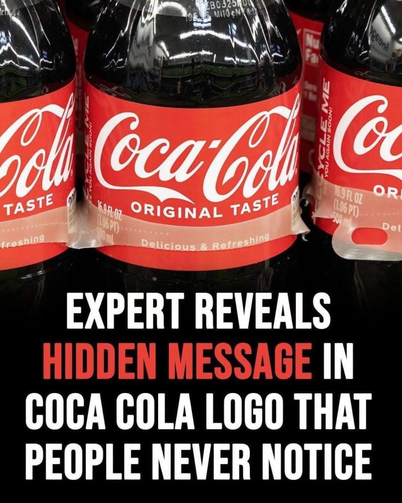
The Coca-Cola logo is one of the world’s most recognizable brand marks. With its distinctive red-and-white color scheme and elegant cursive font, it has been a symbol of refreshment and happiness for generations. Recently, some observers have pointed out a subtle detail within the logo: the second “C” in “Coca-Cola” appears to resemble a smile. This observation has sparked renewed interest in how we perceive brand design and the meanings that emerge as logos are interpreted over time.
The Smile: A Subtle Visual Detail
According to design enthusiasts and online commentators, the upward curve of the second “C” creates the illusion of a gentle smile. At first glance, this effect may seem coincidental, but once seen, it’s hard to ignore. The flourish of the letter’s upper curve and its outward stretch evoke a sense of warmth and cheerfulness. The logo, viewed through this lens, feels more inviting—as if it’s quietly grinning at the observer.
Much like noticing shapes in clouds, the realization of the “smile” can transform the perception of the entire wordmark. This phenomenon speaks to the ways in which human perception finds meaning—even faces and emotions—in simple shapes. The emotional impact of seeing familiar, friendly features can subtly influence how people feel about the brand.
Historical Context: Origins of the Coca-Cola Script
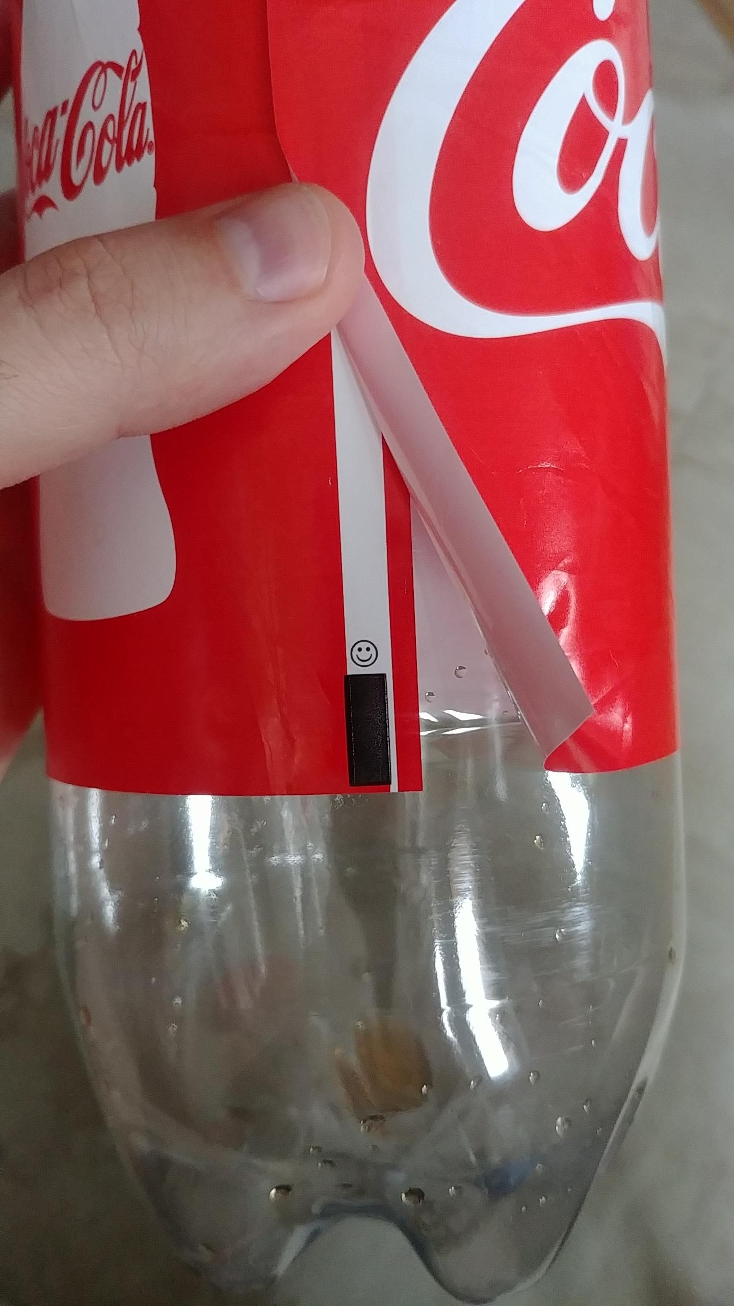
The Coca-Cola wordmark was originally designed in the 1880s by Frank Mason Robinson, a bookkeeper who named and branded the beverage for its inventor, John S. Pemberton. Robinson’s intention was to make the logo highly distinctive, opting for Spencerian script—a style popular in American business correspondence at the time. Spencerian handwriting was characterized by flowing loops, sweeping lines, and ornate flourishes, making it both aesthetically appealing and memorable.
The signature script quickly became a hallmark of the brand, symbolizing tradition and authenticity. Historical records and early advertisements reveal that the design was not intended to contain hidden visual meanings, such as a smile. Robinson’s focus was on legibility, elegance, and uniqueness. Despite this, modern viewers have discovered new interpretations, demonstrating the enduring appeal and adaptability of classic design.
Logo Evolution and Brand Identity
Over the decades, the Coca-Cola logo has undergone minor adjustments—refinements in line thickness, spacing, and color clarity—to keep it relevant while preserving its iconic character. The core elements of the script, including the distinctive second “C,” remain unchanged.
Coca-Cola’s branding strategy has consistently revolved around messages of happiness, enjoyment, and togetherness. Advertising campaigns, product packaging, and sponsorship events frequently emphasize positive emotions. The discovery of a “smile” within the logo aligns with these themes, reinforcing the brand’s identity even if it was not an intentional design feature.
Human Perception and Pareidolia
The tendency to see shapes, faces, and emotions within visual patterns is known as pareidolia—a psychological phenomenon studied by scientists and design experts. Pareidolia occurs when the brain seeks meaningful interpretations in ambiguous stimuli. Famous examples include seeing animals in clouds or faces in everyday objects.
In the case of the Coca-Cola logo, pareidolia explains why some observers perceive a smile in the script. As attention moves to the second “C,” the upward curve reads as a mouth, and the logo feels more personable. Branding professionals agree that such associations can enhance a consumer’s emotional connection to a brand, even when the imagery is accidental.
Discussion Among Designers and Brand Experts
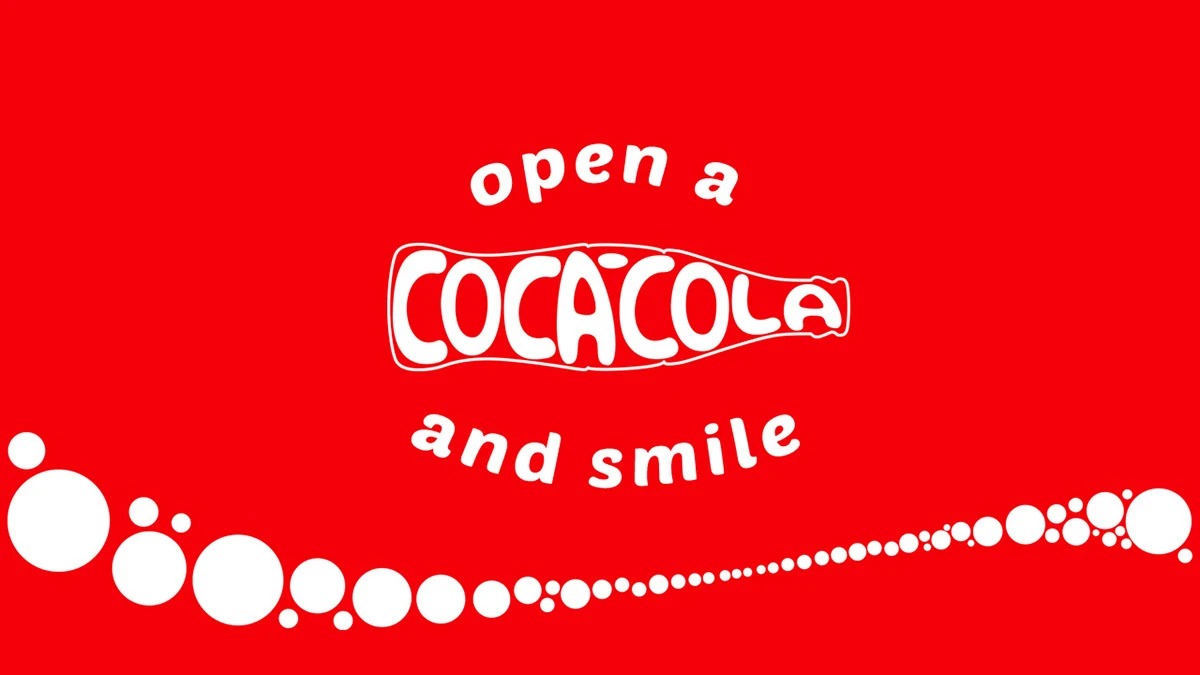
Design experts appreciate the power of simple, evocative shapes in logo creation. While the Coca-Cola logo was not intended to contain hidden meanings, its elegant features foster new interpretations as audiences discover them. Many designers view this phenomenon as a testament to the lasting impact of well-crafted logos—a sign that good design continues to resonate and evolve in the public imagination.
The “hidden smile” has inspired conversations within design communities, with some professionals considering how subconscious cues and visual metaphors can enhance branding. The Coca-Cola example illustrates how meaning can emerge organically, shaped by cultural trends, consumer psychology, and changing perspectives.
International Reception and Cultural Interpretation
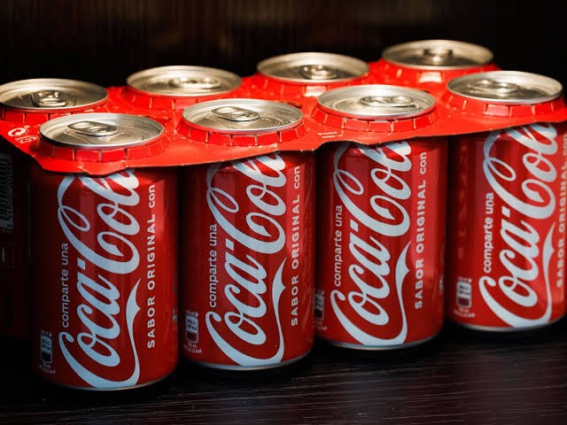
Coca-Cola is a global brand, and its logo is recognized in nearly every country. Interestingly, perceptions of the logo, including the “smile,” can vary by culture and context. In some regions, the script is associated primarily with tradition and nostalgia; in others, it is a symbol of youth and fun.
Studies in cross-cultural branding show that universal visual cues—such as a smile—can communicate positivity regardless of language or geography. The revelation of the “smile” in the logo reinforces Coca-Cola’s global message of joy and sociability, helping to bridge cultural differences and foster a common experience among consumers.
Impact on Consumer Experience
The emotional influence of logos is an important consideration for marketers and brand strategists. Research indicates that subtle, friendly imagery can contribute to customer loyalty and positive associations. In the case of Coca-Cola, recognizing a “smile” within the logo creates a sense of warmth and connection, reinforcing the brand’s promise of enjoyment.
Many consumers report that once the “smile” has been noticed, it alters how they interact with the brand. The logo becomes more than just a word—it transforms into a symbol imbued with emotion and depth. This experience supports the idea that classic designs retain their relevance by enabling new interpretations over time.
Conclusion: Timelessness and Evolution in Brand Design
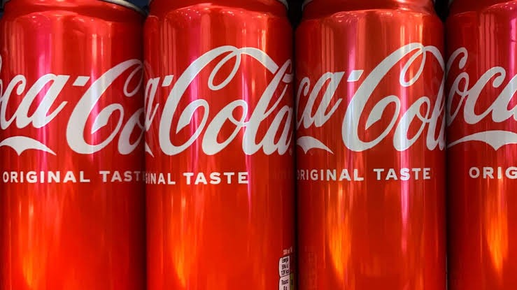
The Coca-Cola logo is a prime example of how classic design continues to resonate with audiences across generations. The emergence of the “smile” in the second “C” demonstrates the dynamic relationship between visual art and human perception. Whether intentional or accidental, the smile enriches the brand’s message, reinforcing the values of happiness and togetherness that define Coca-Cola’s identity.
As logos age, they gather new meanings, shaped by audience interpretation and cultural context. The Coca-Cola wordmark remains a cultural icon because of its adaptability. It invites users to look closer, find joy in small details, and appreciate the craft underlying enduring branding.
This case also highlights the broader role of design in our lives. Logos are more than static symbols: they evolve, engage, and inspire, reflecting the complex bond between brands and their audiences. The “hidden smile” in the Coca-Cola logo is a reminder of design’s capacity to evoke feeling and connect people around the world.
Sources
- BBC: The Story Behind the Coca-Cola Logo
- Reuters: Coca-Cola’s Logo Evolution
- The Guardian: Coca-Cola and Branding History
- Al Jazeera: Coca-Cola’s Global Branding
Disclaimer: This content is intended for entertainment purposes only and is not based on real events.