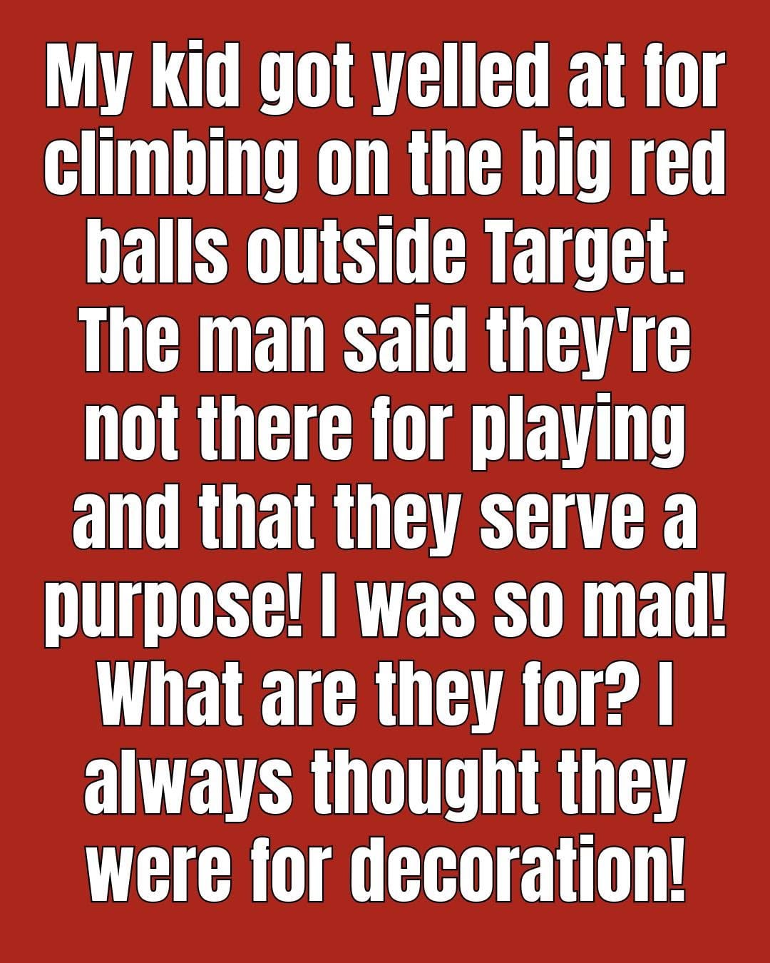
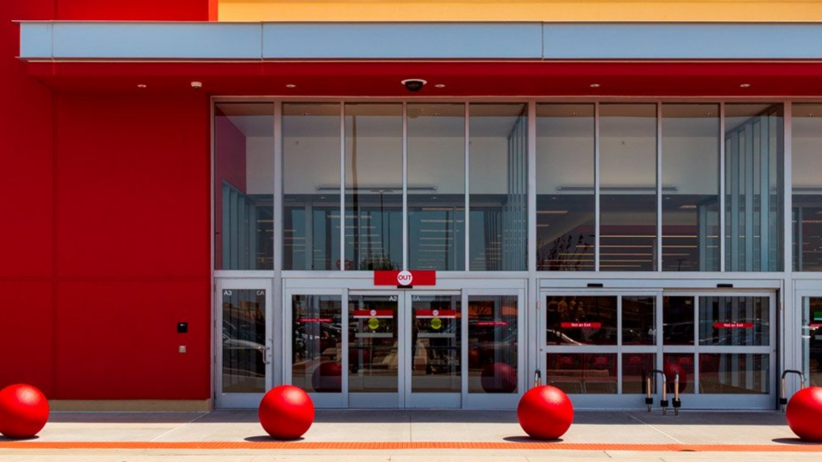
If you’ve ever visited a Target store, chances are you’ve noticed the large red concrete spheres lined up outside the entrance. For many shoppers, they’re simply part of the scenery. Children often climb on them, families use them as meeting points, and countless photos have been taken beside these unmistakable red landmarks.
But have you ever wondered why they’re there?
While they have become one of Target’s most recognizable design features, those bright red spheres were not placed outside stores purely for decoration. They combine practical safety, thoughtful architecture, and clever branding into one simple feature.
Here’s the story behind one of retail’s most recognizable design elements.
More Than Just Decoration
At first glance, the oversized red balls appear playful and artistic.
Their smooth, rounded shape softens the appearance of large parking lots and storefronts, making entrances feel more inviting than rows of metal barriers or plain concrete posts.
However, behind their friendly appearance lies an important practical purpose.
Many of the red spheres function as protective vehicle barriers designed to help separate pedestrian areas from vehicle traffic near store entrances.
Helping Improve Safety Around Store Entrances
Modern retail stores welcome thousands of visitors every day.
Busy parking lots mean drivers are constantly entering and leaving spaces, sometimes while navigating crowded areas filled with pedestrians, shopping carts, and other vehicles.
Protective barriers can help reduce the risk of vehicles accidentally entering pedestrian zones if a driver loses control, becomes distracted, or mistakenly presses the accelerator instead of the brake.
Large concrete barriers are one of several safety measures commonly used around commercial buildings.
Although their exact design varies by location, they are intended to help create an additional layer of protection between vehicles and entrances.
Why Are They Round Instead of Posts?
Many buildings use cylindrical bollards or steel posts.
Target’s designers chose large spheres that accomplish several goals at once.
The rounded design has no sharp edges, creating a friendlier appearance while remaining highly visible from every direction.
Their shape also complements the company’s well-known visual identity.
Rather than making security feel intimidating, the spheres blend into the overall shopping experience.
A Perfect Match for the Target Brand
The bright red color is impossible to miss.
For decades, Target has built its identity around the iconic red-and-white bullseye logo.
The red spheres reinforce that branding before customers even enter the building.
From across a parking lot, shoppers immediately recognize the familiar color scheme.
The design serves both practical and marketing purposes, helping stores remain instantly identifiable even without reading the sign.
An Example of Functional Design
Architects often describe successful public design as something that combines usefulness with visual appeal.
Target’s red spheres are a classic example.
Instead of hiding safety features, the company incorporated them into the overall aesthetic of its stores.
The result is a feature that feels welcoming while quietly serving an important purpose.
This approach reflects a broader trend in architecture, where functional elements are integrated into attractive public spaces rather than appearing purely industrial.
Why They Became So Popular
Over time, the red spheres developed a life of their own.
Many shoppers now associate them with childhood memories.
Children often enjoy sitting on them while parents organize shopping bags or prepare to enter the store.
Friends commonly use them as convenient meeting spots.
Social media has also helped turn them into recognizable photo locations.
For many families, they have become an unofficial part of the Target shopping experience.
Do All Target Stores Have Them?
Not every Target location looks exactly the same.
Store layouts vary depending on local building codes, available space, and site design.
Some locations feature the classic large red spheres.
Others use different types of protective barriers or combine spheres with traditional bollards.
Regardless of the exact design, pedestrian safety remains an important consideration for store entrances.
Why Bright Colors Matter
The vivid red color serves another practical purpose beyond branding.
Bright colors naturally attract attention.
Highly visible barriers are easier for drivers and pedestrians to notice, especially in busy parking lots or during poor weather conditions.
Visibility contributes to overall awareness around entrances where both vehicles and people share the same space.
Blending Safety With Customer Experience
Retail designers carefully consider how customers feel as they approach a store.
Large steel barriers might communicate security but could also create a harsh or industrial atmosphere.
Rounded concrete spheres soften that impression.
Their playful appearance helps maintain an inviting environment while still serving as substantial physical barriers.
This balance between function and appearance has become one of the defining characteristics of Target’s store design.
A Design That Evolves With the Seasons
Another reason the spheres remain so popular is their flexibility.
Some Target locations decorate them during holidays or community events.
Temporary seasonal colors, festive decorations, or themed displays occasionally transform the familiar red spheres into part of the celebration.
These creative touches reinforce the idea that practical infrastructure can also contribute to a welcoming shopping environment.

Why Simple Design Often Lasts
Many iconic designs succeed because they solve multiple problems at once.
Target’s red spheres:
- Help define pedestrian spaces.
- Support store safety.
- Strengthen brand recognition.
- Create memorable visual landmarks.
- Add character to otherwise ordinary parking lots.
Because they accomplish all of these goals simultaneously, they have remained a recognizable feature for decades.
What We Can Learn From Everyday Design
It’s easy to overlook familiar objects that we pass every day.
Yet many common features around us were created with careful planning and multiple purposes in mind.
The large red spheres outside Target stores remind us that thoughtful design can combine beauty, functionality, and public safety without drawing attention to itself.
What appears to be a simple decorative object often reflects collaboration among architects, engineers, designers, and safety professionals.
Final Thoughts
The next time you visit a Target store, those bright red spheres may look a little different.
Far from being random decorations, they represent an example of thoughtful design that combines customer safety, brand identity, and visual appeal. Their welcoming appearance has made them one of the most recognizable features in American retail, while their practical role quietly supports a safer shopping environment.
Sometimes the most familiar objects have the most interesting stories. By looking a little closer, we discover that good design is often about solving real-world challenges in ways that feel simple, inviting, and timeless.
Sources
- Target Corporate Information
- American Society of Civil Engineers (ASCE): https://www.asce.org
- National Institute of Building Sciences (NIBS): https://www.nibs.org
- Federal Highway Administration (FHWA) – Roadside Safety Guidance: https://highways.dot.gov
- National Safety Council (NSC): https://www.nsc.org